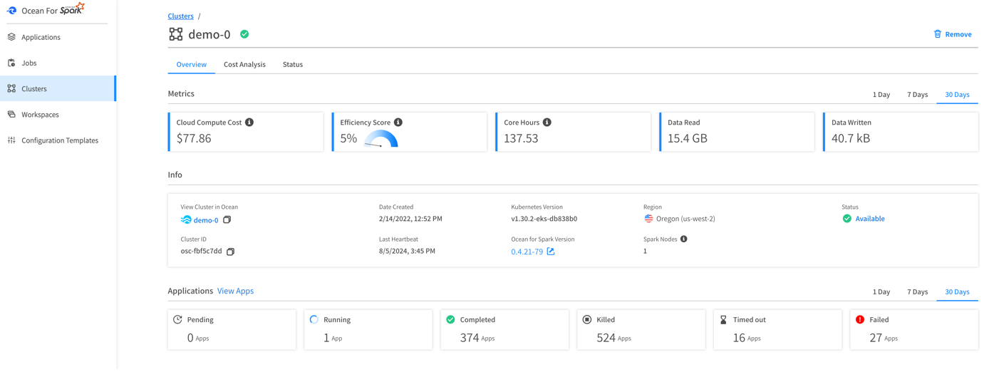
Ocean for Apache Spark metric console: Cluster view
The data industry is increasingly adopting Apache Spark™ on Kubernetes due to its significant capabilities and advantages over running Spark on YARN. However, it is widely acknowledged that managing, scaling, and debugging open source systems can be challenging.
Our primary goal of the Ocean for Apache Spark (OfAS) team at Instaclustr by NetApp is simplifying the deployment and usage of Apache Spark on Kubernetes.
A key aspect of this involves improving the Spark user experience. We do this by offering enhanced metrics and visualizations for Spark’s workloads, enabling our users to debug and understand their applications, hence maintaining cost-effective and efficient data processing with Apache Spark.
We have recently introduced a new set of these enhancements, which we will discuss in this blog.
But before diving into that, let’s first examine the current Spark situation.
The Apache Spark UI Usage Dilemma
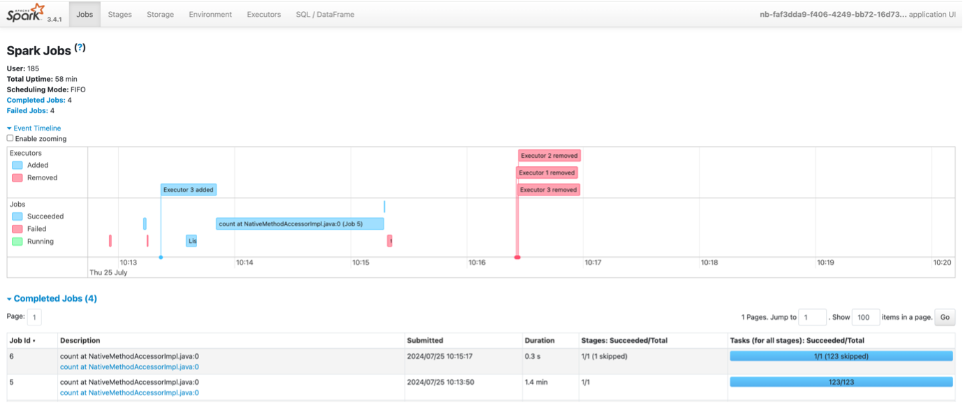
Apache Spark UI
Apache Spark is a powerful open source unified analytics engine for large-scale data processing. It provides a web-based user interface – the Spark UI – which displays a range of metrics about the applications, such as a summary of task completion, a timeline of task execution, and statistics about garbage collection (GC) and memory usage.
The Spark UI is the only interface Spark users have to understand their applications. Every Spark developer has, at some point, experienced a need to rush into the Spark UI to debug, optimize or simply to comprehend the behavior of their apps!
However, using these metrics to gain insights into workloads and the intricacies of Spark internals can be a challenging and frustrating process for developers.
Key Information Is Buried Under a Lot of Noisy Data
The Spark UI provides a vast amount of data, which can be overwhelming. It includes:
- Spark environment
- Nodes and executors
- Environment properties and parameters
- Jobs: running, completed, terminated, or failed
- DAG visualization
- Query plans
- Jobs, stages and tasks summary and metrics
- Executor usage and metrics
- and much more
Navigating through all of this requires some great patience and courage! It is daunting for new and even seasoned Spark developers to get through and identify the metrics that are most relevant to their specific workloads and needs.
For instance, understanding the implications of task deserialization time, JVM garbage collection time, or shuffle read/write metrics requires a good grasp of Spark’s architecture and execution model.
Static Data for a Dynamic Usage
The Spark UI is a snapshot tool; it provides information about the state of the application at a specific point in time. It does not offer trend analysis or historical data comparison, which are often crucial for understanding workload patterns and making performance optimizations. Developers must then manually correlate this information with their current runs and code, which can be a time-consuming and error-prone process.
Additionally, the Spark History Server, rendering the Spark UI after an application is finished, is hard to setup (a quick glance at the documentation would confirm this). To achieve this, you need to save and persist Spark event logs to a long-term storage and often run it yourself, incurring costs and maintenance burden. It takes a long time to load, and it is tedious to make things work properly.
Node Metrics (CPU, Memory, and I/O Usage), the Missing Link
The Spark UI is missing crucial information: node metrics such as CPU, Memory, and I/O usage. Operating without these metrics is like walking in the dark. As an alternative, a separate node metrics monitoring system, such as Ganglia or Prometheus + Grafana, could be set up. However, this would still necessitate switching between this monitoring system and the Spark UI.
These challenges slow down the debugging and optimization process, reducing Spark developer productivity, but don’t worry, we have a solution for it.
Don’t Throw Everything Away. OfAS New Enhanced Metrics Can Help
Despite these challenges, the Spark UI can still provide valuable insights for optimizing workloads. So, we build our set of enhanced metrics and visualizations on top of relevant information from Spark UI and Spark History Server.
OfAS users get an UI where they can view the logs and metrics for each of their Spark applications. They can also access the Spark UI (if needed). Here is a summary of key insights from OfAS Application Details:
- Metrics
- App info
- Insights
- Logs
- View configuration
- View Spark issues
To find more details, visit our official documentation.
Application Overview Tab
Start with the overview tab, which provides overall access to insights and summary data about the application. This tab allows you to gain a snapshot of your current costs, efficiency status, app metrics, and access to logs. More detailed information about the application can be found in other tabs, including its configuration and a list of Spark issues.
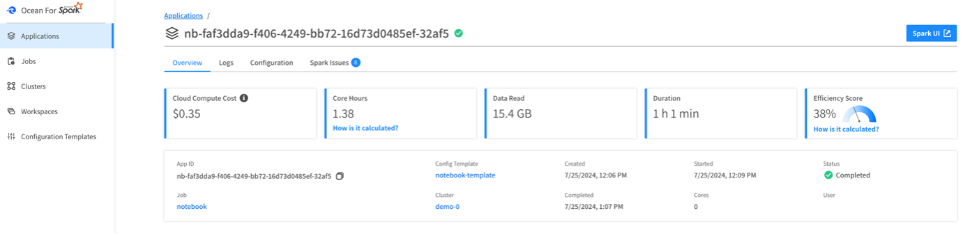
OfAS metric console: Application view
Note that the cloud compute cost is an estimation based on cloud VMs usage since that’s the biggest factor affecting the overall costs of your Spark jobs. Other charges, such as networking and attached storage, are either minimal or will scale linearly with your VM costs. If a more accurate cost estimate is required, it is recommended to contact your cloud provider directly.
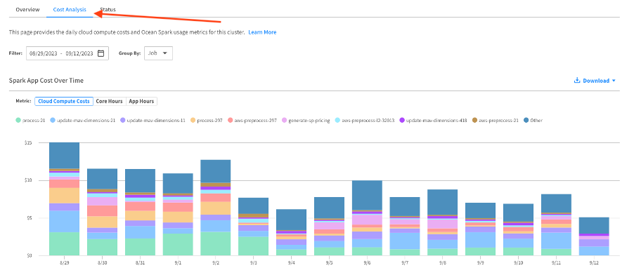
OfAS metric console: Cost Analysis view
Enhanced Metrics and Visualizations
The Insights area gives information about the resource usage of the application over time. The first tab shows executors CPU usage, broken down by categories (CPU, I/O, shuffle, GC, Spark internals). This graph aligns with a timeline of your Spark jobs and stages, so that it’s easy to correlate CPU metrics with the code of your Spark application.
Although we have centralized the main relevant metrics in this graph view, you can click on a job or stage in the timeline to navigate to the Spark UI page for that specific job or stage. This allows you to access a higher level of granularity and detailed information that may be necessary in certain situations.
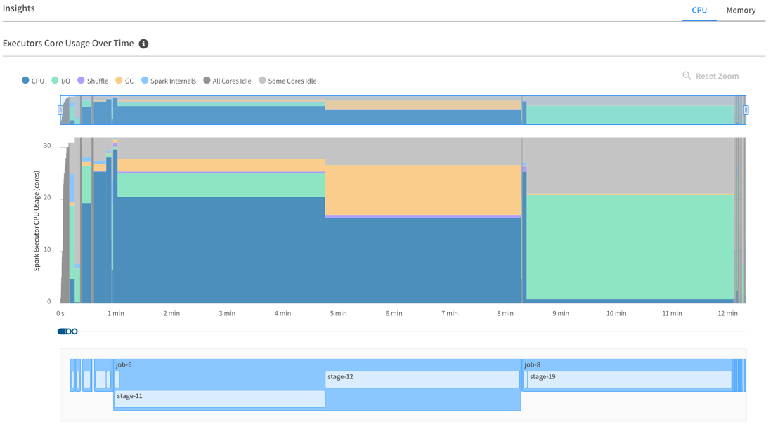
OfAS metric console: Executors Core Usage Over Time
The second tab provides a report of the memory usage of your Spark executors over the application’s job and stages timeline. On the left-hand side, you can see the peak memory usage for each executor, broken down by category (JVM, Python, other).
This graph should help right size your instances so that memory usage stays in the 70-90% range. Clicking on the executor list allows you to view detailed memory usage for that executor in the bottom graph. You can zoom in on the timeline to gain granular insights into memory usage over time:
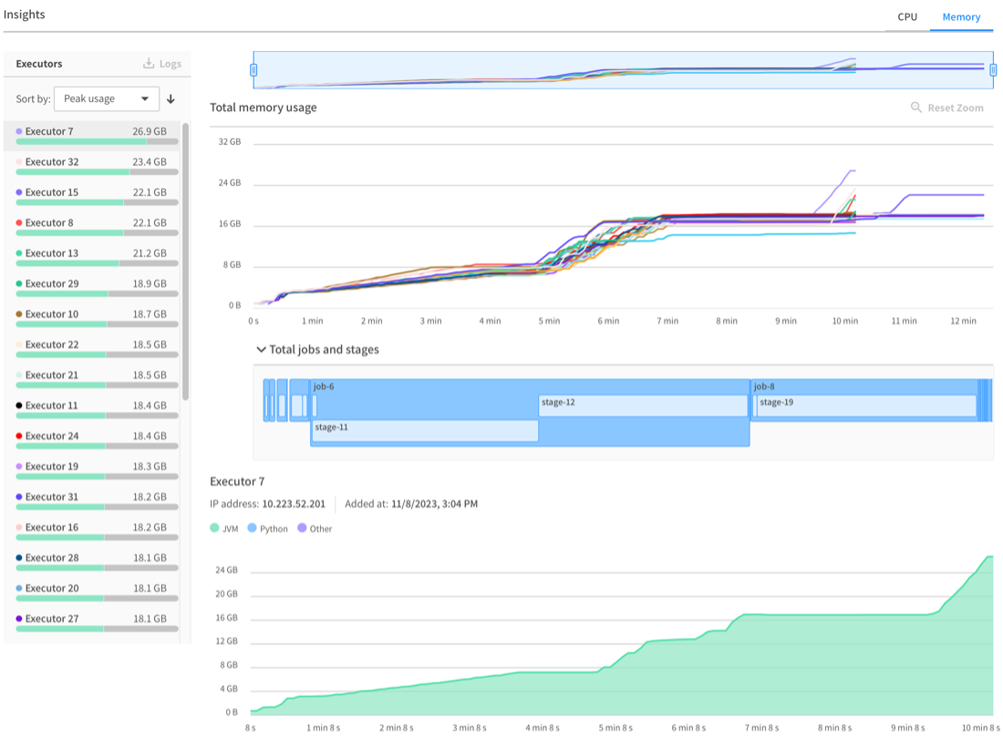
OfAS metric console: Executors Memory Usage Over Time
Displaying meaningful memory metrics in our product helps users to easily and directly detect Out Of Memory issues (OOM, the most common disease of Spark). Note that we have implemented 2 memory auto-tuning strategies to dynamically adjust the executor memory. These strategies analyze the performance of previous applications to automatically optimize memory allocation.
By leveraging historical performance data, the auto-tuning mechanisms can make informed adjustments to the executor memory settings, ensuring more efficient resource utilization and potentially improving the overall performance and stability of your Spark applications.
Executor Logs and Failure Reason
Ocean for Apache Spark offers significant added value by leveraging spot instances to reduce operational costs. Not only do we optimize the deployment and operation of Apache Spark workloads on Kubernetes using advanced cloud infrastructure optimization technology, but we also focus on identifying and addressing executor loss and failure.
Executor removal is a common occurrence, whether benign or malignant, due to the elastic nature of Spark. Factors such as auto-scaling, dynamic allocation, hardware failures, and the use of spot instances can all contribute to executor removal.

OfAS metric console: Executor Failure
When an executor is removed, we provide detailed information by displaying the reason for its removal in the executor details. This transparency helps users understand the underlying causes and take appropriate actions to maintain the stability and efficiency of their Spark applications.
Logs
While the application is running, you can view both the driver logs and the Kubernetes logs in real-time through OfAS UI. Ultimately, in some edge cases, one cannot avoid delving deeply into the logs, as this is sometimes the only way to understand what has happened. To facilitate this, we offer a convenient feature that allows users to download the logs for an executor with a single click once the application has terminated.
View Spark Issues
Our Spark Issues tab lists detected issues along with their corresponding error messages. Although not exhaustive, it surfaces the main errors and logs generated by a Spark application. By clicking on an issue, users can expand the card to view more detailed information about the error or warning.
This feature allows users to quickly identify the root cause of the problem and take corrective actions. The detailed insights provided help streamline the troubleshooting process.
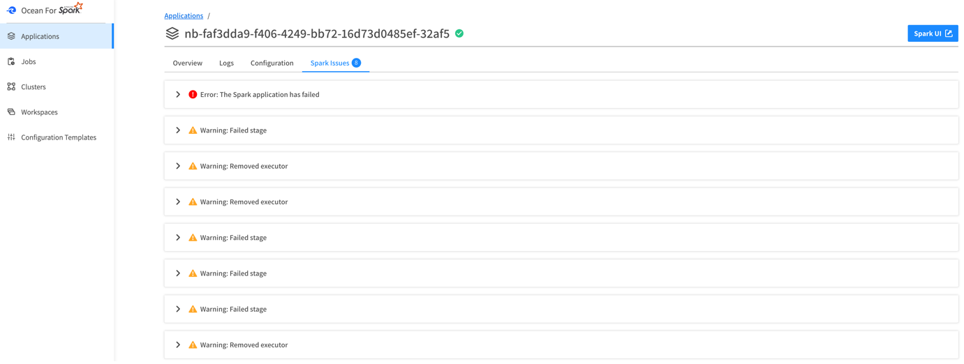
OfAS metric console: Spark issues
You Get Even More Insights
We released these features, along with several others, a couple of weeks ago to our preview customers, and the feedback has been overwhelmingly positive. In addition to the features we have listed in this blog, users of Ocean for Apache Spark have unexpectedly and surprisingly gained more valuable insights that have helped them detect and address various issues, including:
- Over-provisioning of executors
- Partitioning inefficiencies
- Over-utilization or under-utilization of the Spark driver
- Incorrect timing in data collection
- Misallocation of cores and executors
These enhancements have significantly improved the ability of our users to optimize their Spark applications, leading to better performance and resource utilization.
Conclusion
The Spark UI offers incredible metrics and insights into understanding your Spark workloads, but understanding and using this data doesn’t come easy. That’s why the OfAS team has developed these enhanced metrics and visualizations – and give you the power to expertly debug and optimize your workload without the hassle that Spark UI is known for.
To experience the benefits of NetApp’s managed Ocean for Apache Spark solution, please schedule a meeting with our team of experts. We can discuss your specific use case and explore how we can help optimize Apache Spark for your organization.
In the meantime, visit our website to explore our latest blogs and content.